Visualization
Shows how to explore your data on the analysis page: creating views, choosing what each one shows, arranging them, filtering and syncing them, and saving your work.
1The analysis page
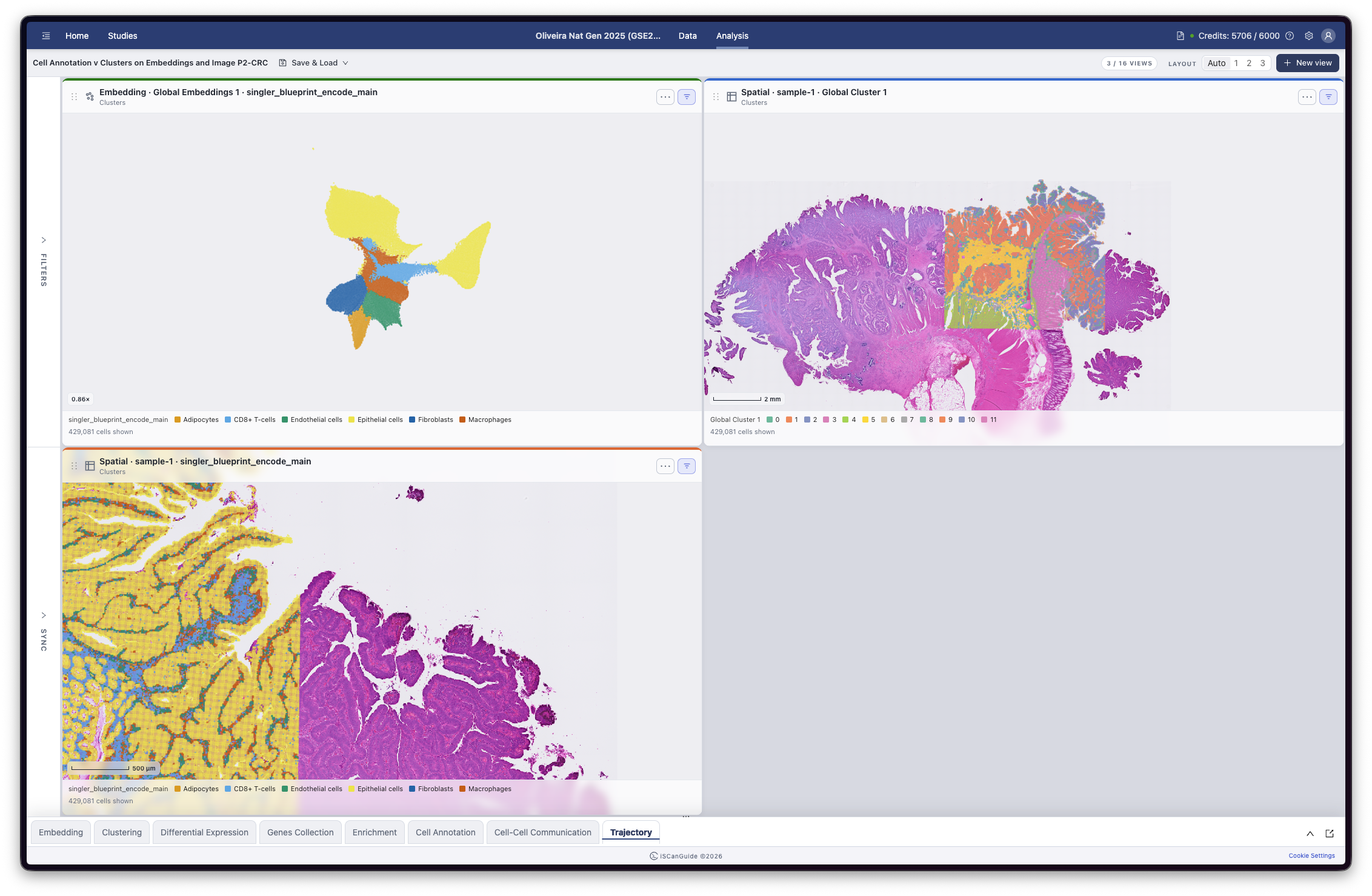
The analysis page is where you explore your data. Create views to look at it in different ways, and arrange them side by side to compare. Filtering and syncing are in the rail on the left. View controls and Save & Load are along the top. The analysis modules are in the drawer at the bottom.
Note: sharing lives on the studies page, not here. See the Create Study guide.
2Open the new view form
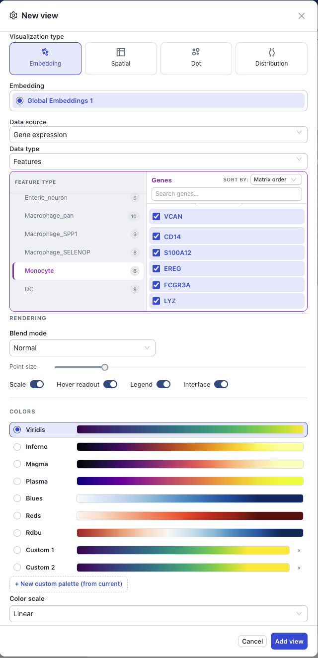
Click New view to open the form. The counter beside it shows how many views you have and the maximum. At the maximum, New view is unavailable until you remove a view.

3Choose a visualization type
Start with Visualization type. Embedding plots your cells in two dimensions and Spatial places them on the tissue image. Dot and Distribution summarise values across groups instead of drawing every cell. Then pick what to draw it from: an embedding, or the samples, if you chose Spatial.
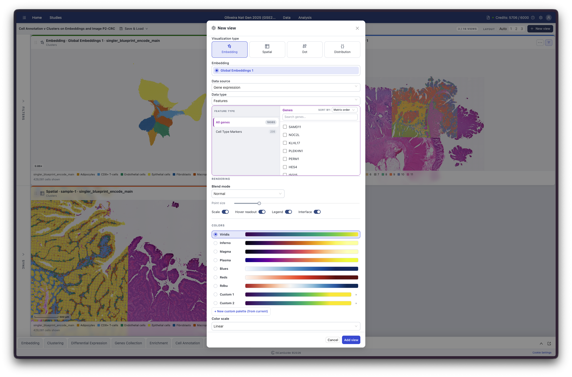
Visualization types
| Type | Shows |
|---|---|
Embedding | Your cells positioned by the embedding |
Spatial | Your cells positioned on the tissue image |
Dot | One dot per group and feature. Colour is the group's mean expression, size is the fraction of its cells expressing |
Distribution | The spread of values within each group |
A type you cannot use is greyed out, and hovering it explains why. Spatial needs a spatial sample, and Dot and Distribution need an embedding and feature data.
4Choose a data source
Data source is where the values come from: gene expression, or the results of an enrichment or cell-cell communication run. A source you have no results for is unavailable, and hovering it tells you why.
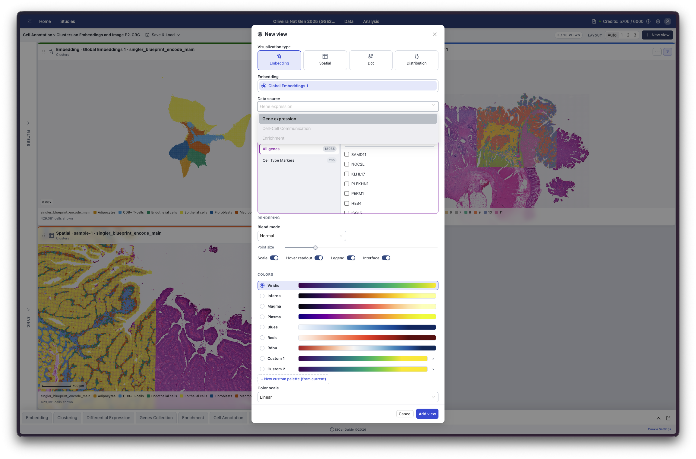
Data sources
Gene expression, Cell-Cell Communication, Enrichment.
5Choose what to show
For gene expression, Data type chooses between Features and Observations. Then pick the item itself from the two lists beneath: a category on the left, and the specific gene, clustering, annotation or metadata column on the right.
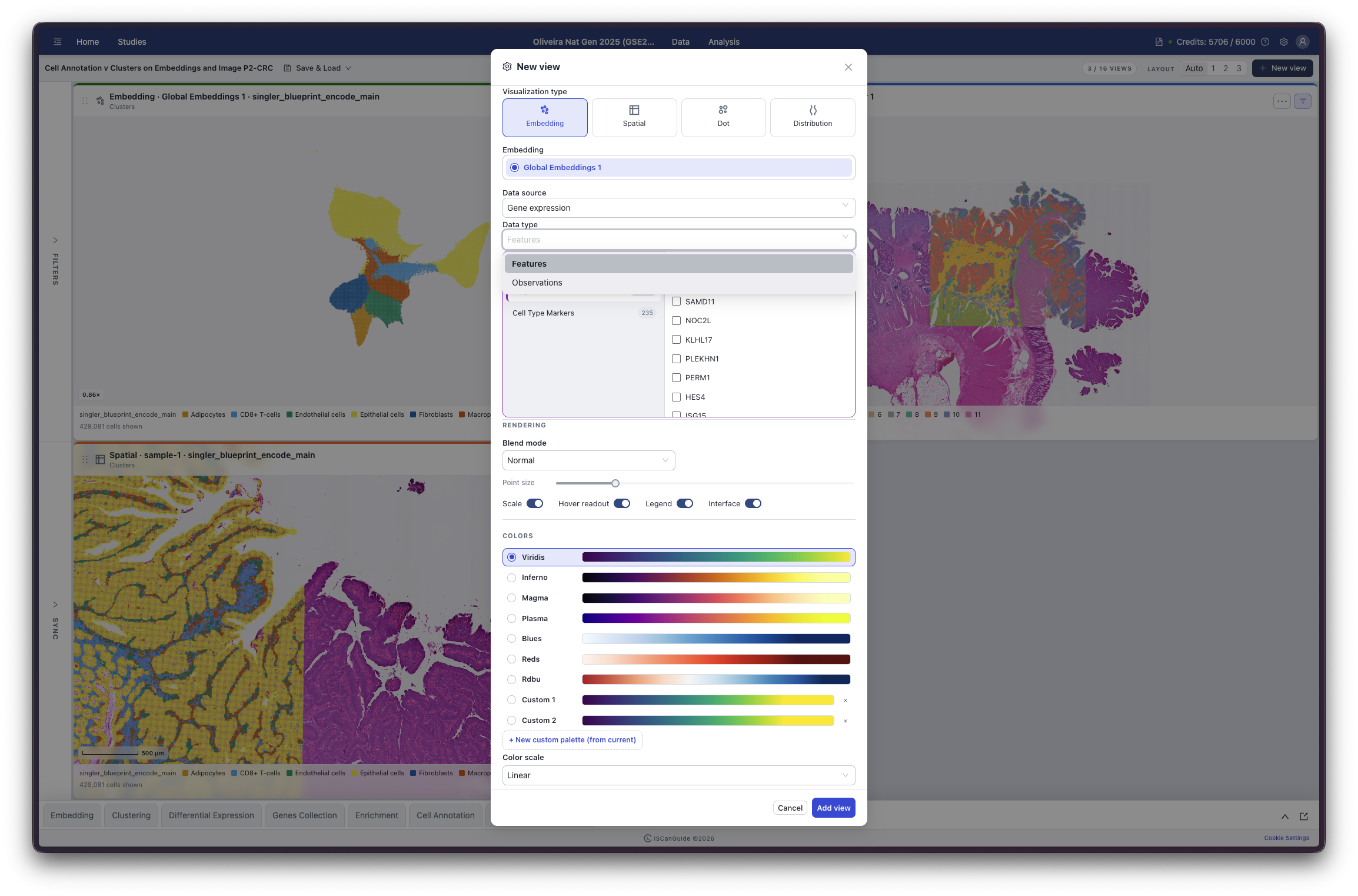
Categories on each side
Data type | Categories |
|---|---|
Features | All genes, plus each of your gene set collections, with a count beside it |
Observations | Cluster, Cell Annotation, Time Trajectory, Categorical Metadata, Continuous Metadata |
A category you have nothing in is greyed out rather than hidden, so the shape of your study stays readable. On the Features side you can search for a gene by name and change how the list is sorted.
Note: Data type appears for gene expression only. Enrichment and cell-cell communication results are their own feature tables, so there is nothing to choose and the control is hidden.
Note: Dot and Distribution add their own settings here — Group by, Scale, Axis range, Layout and a Detection threshold — which decide how the values are summarised.
6Add the view
Click Add view to add it to the page. Add view stays unavailable until you have chosen something to show, and when you are already at the maximum number of views.
7Arrange your views
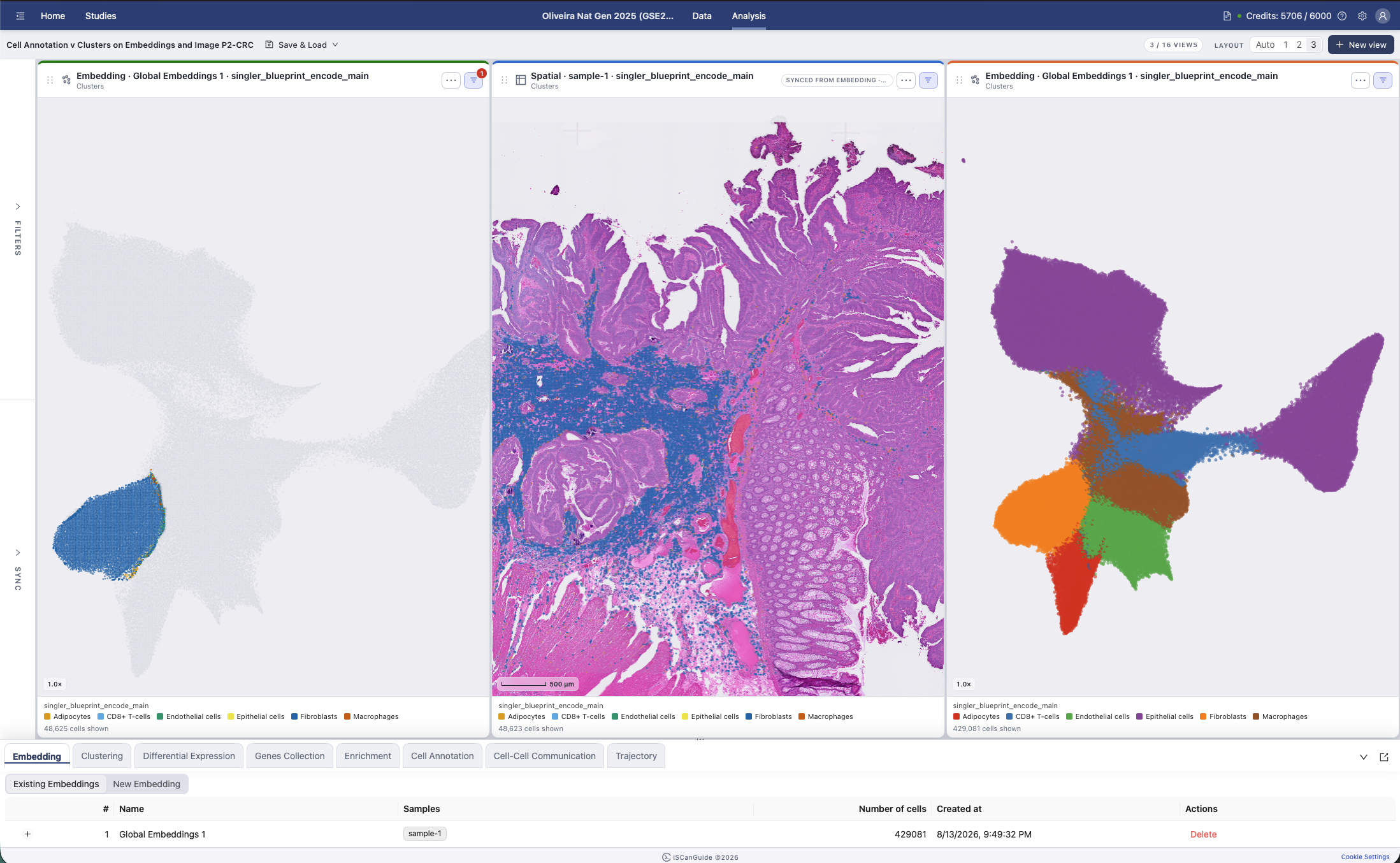
Layout sets how views are arranged. Auto fits them to the space available, or pick 1, 2 or 3 per row.
8Work with a single view
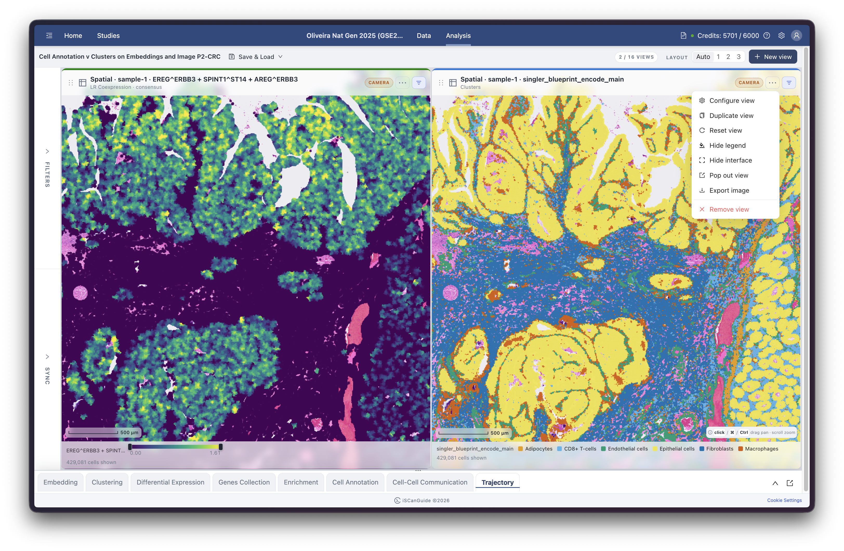
Each view has its own actions menu. Configure view changes what it shows and how it looks. You can also duplicate a view to compare two settings side by side, pop it out into its own window, export it as an image, or remove it. Hide interface hides the controls so you can see the data on its own.
9Change how a view looks
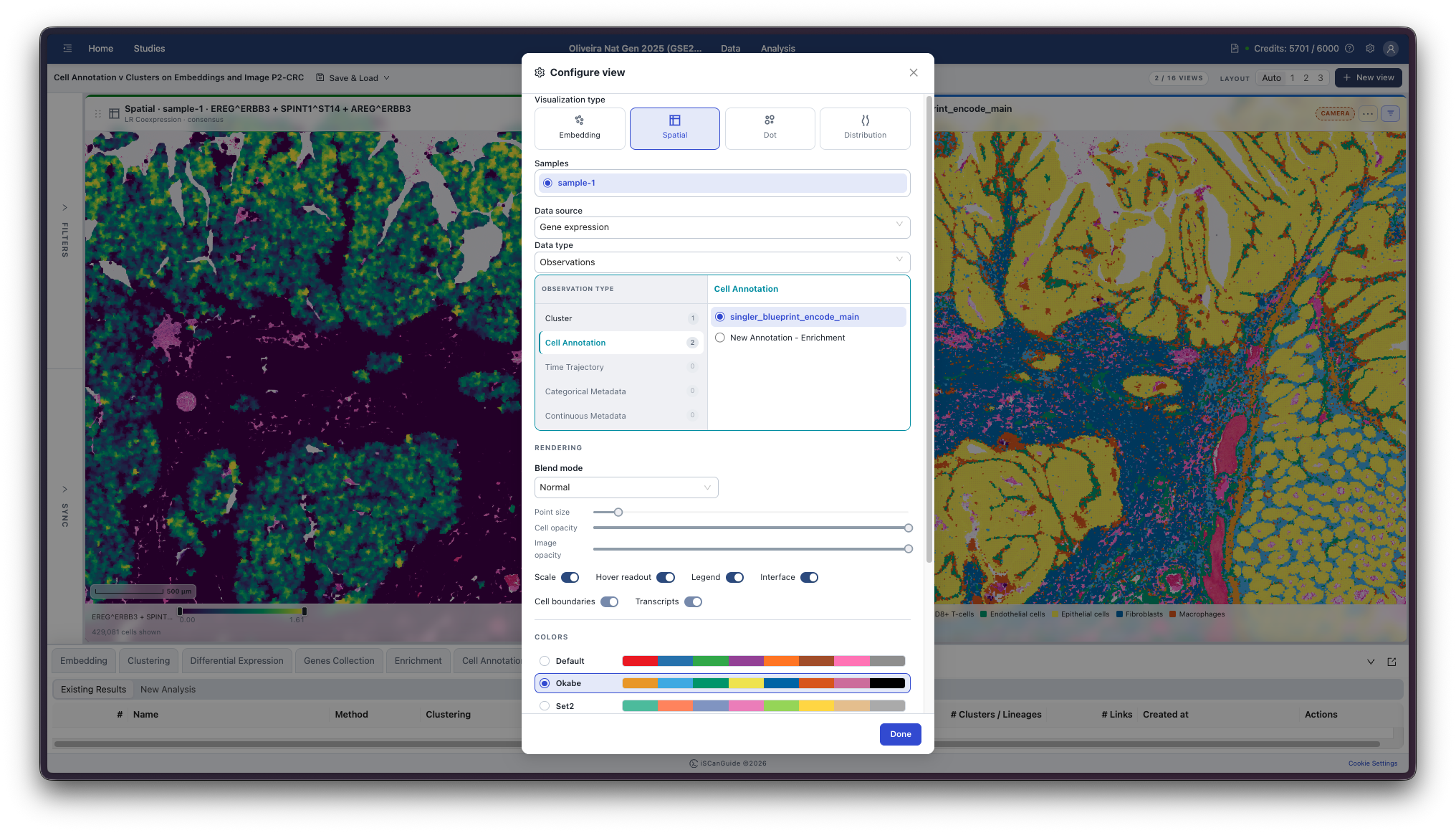
Choose Configure view from a view's actions menu. It is the same form you used to create the view, with two more sections at the bottom. Rendering sets the Blend mode, Point size and the cell and image opacity, and toggles what is drawn — the Legend, the Scale bar, Cell boundaries, Transcripts and the Hover readout. Colors chooses the Palette. Click Done when you are finished.
Rendering and Colors
| Section | Controls |
|---|---|
Rendering | Blend mode, Blend strength, Point size, Cell opacity, Image opacity, Transcript size, Background |
| Toggles | Scale, Hover readout, Legend, Interface, Cell boundaries, Transcripts, Image |
Colors | Palette, Transcript palette, Color scale |
The palettes offered depend on what the view is coloured by. A continuous value such as gene expression offers colour ramps — Viridis, Inferno, Magma, Plasma, Blues, Reds, RdBu — while a categorical observation such as a clustering offers categorical palettes instead. Color scale sets how values are mapped across the ramp.
You can also build your own. New custom palette (from current) starts from whichever palette is selected, and your custom palettes appear in the list alongside the built-in ones.
10Filter your cells
Open Filters in the left rail to narrow down the cells you are looking at. Filters apply to the view you have selected, so you can filter one view without disturbing the others. The bars show how many cells each option keeps, and Reset filters clears them.
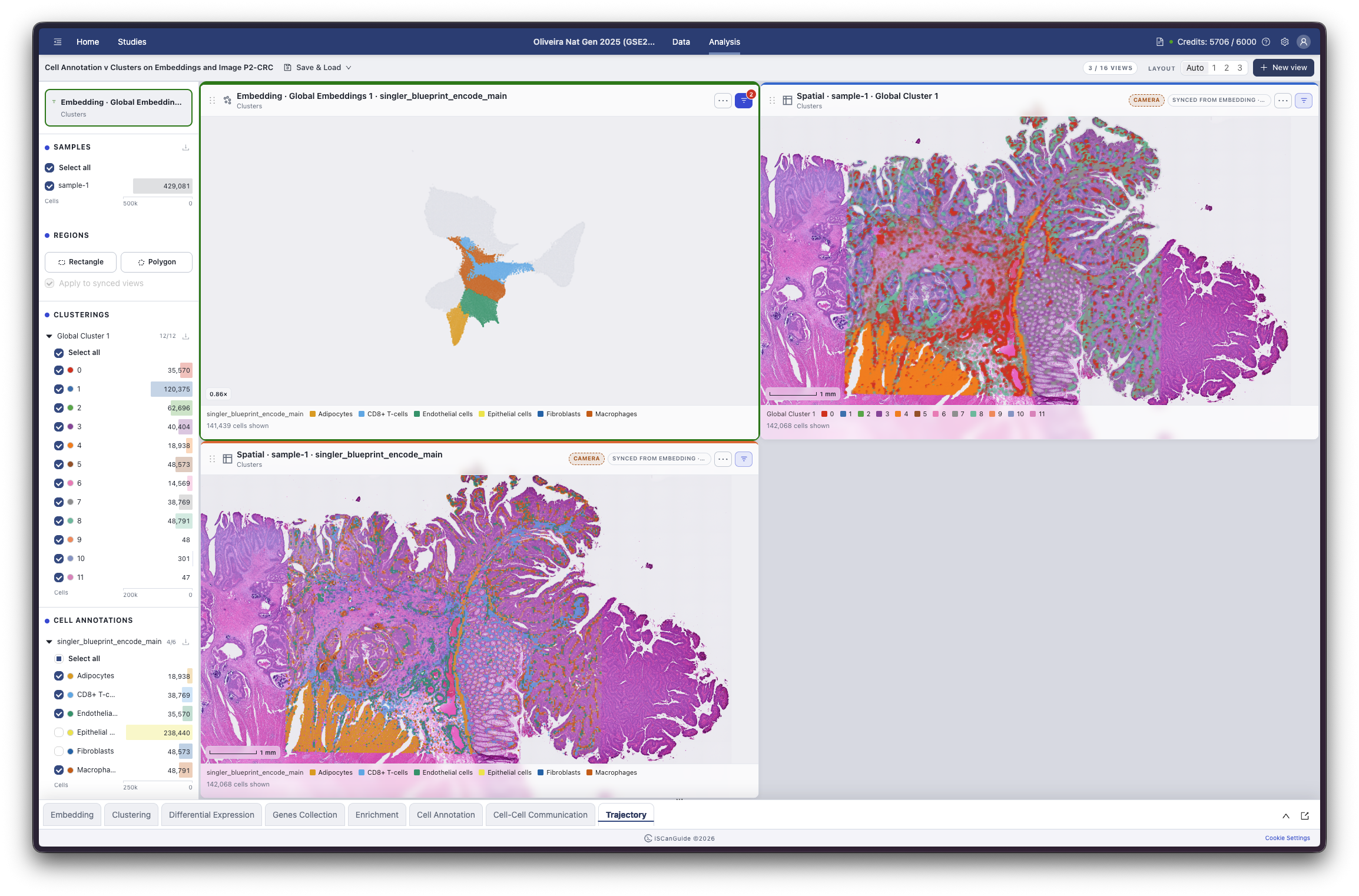
Note: if the selected view is synced with others, the filtering carries across the synced views as well. See Sync views and selections.
11Filter by gene expression
Add an expression filter to keep only cells expressing a gene above a level you set. Search for the gene, then set the range.
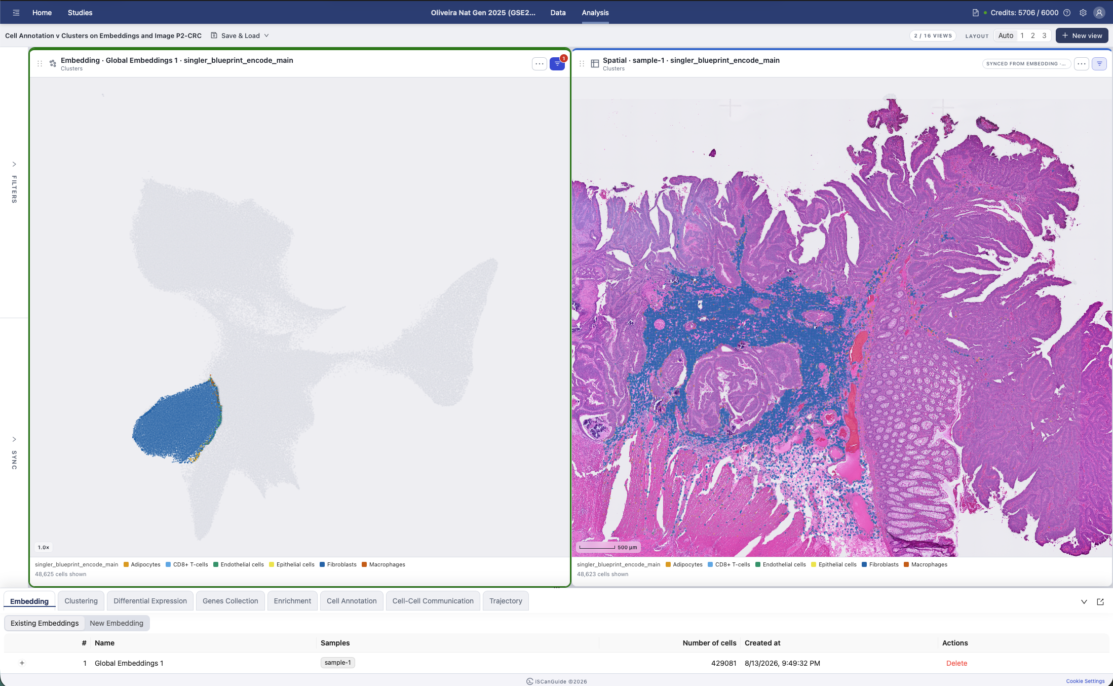
12Draw a region
Draw a region on a view to select the cells inside it. You can filter to that selection, and the analysis modules can use it to define a group of cells.
13Sync views and selections
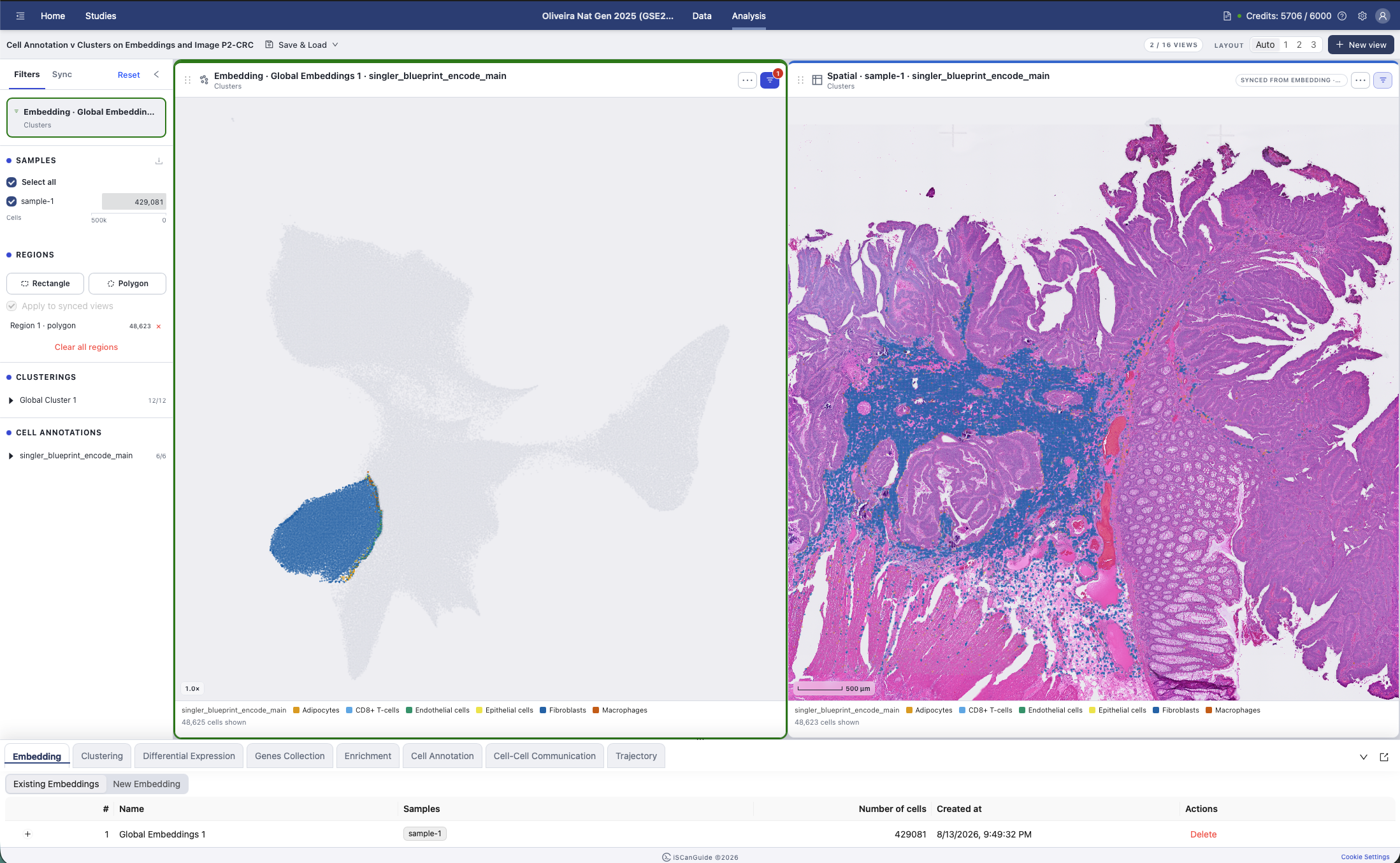
Open Sync in the left rail to link your views. Sync views makes views of the same embedding or spatial sample zoom and pan together. Sync selections makes selecting cells in one view highlight the same cells in every other synced view, including views of a different projection. Filtering carries across synced views too.
14Save and load your work
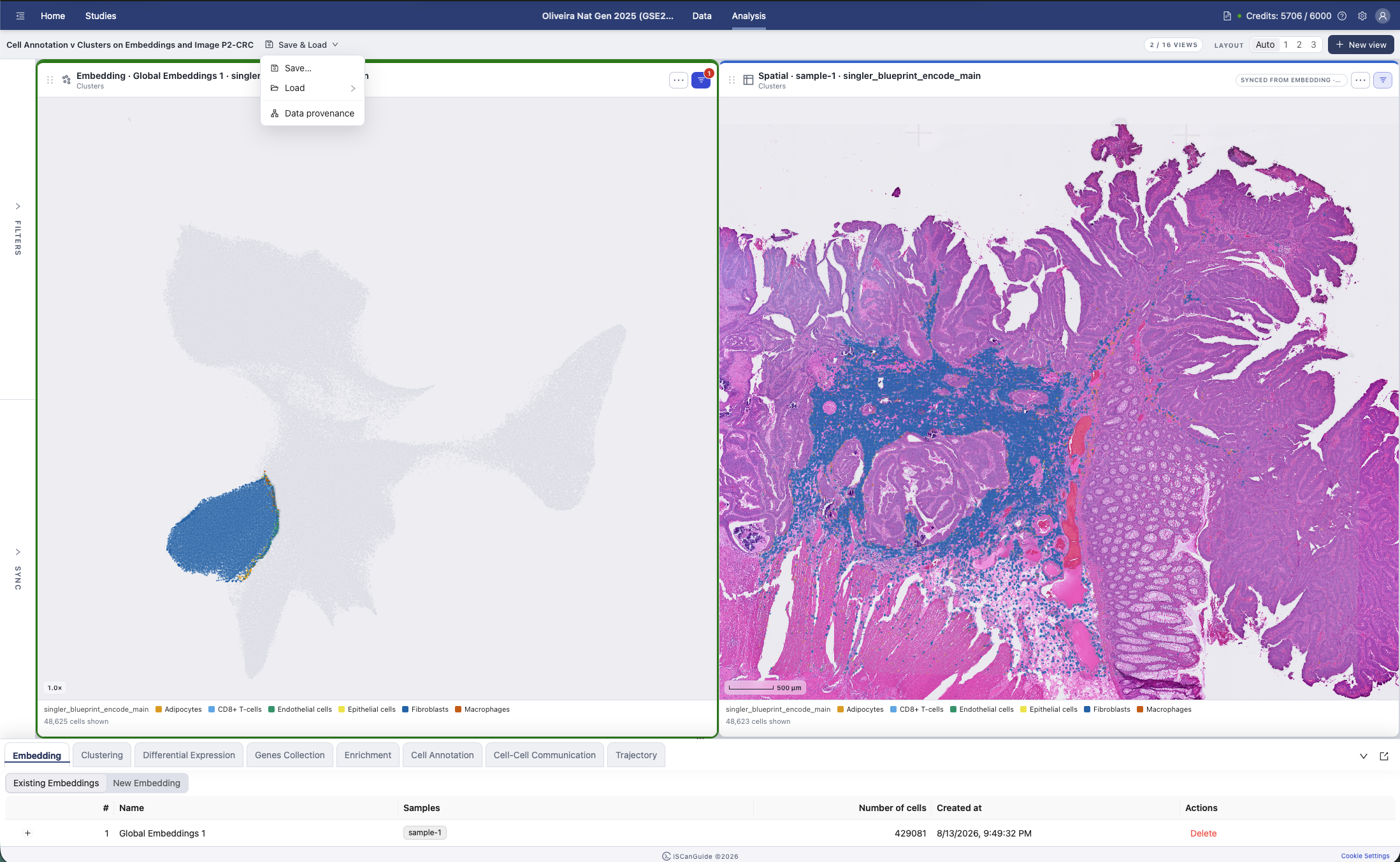
Save… stores the current set of views and settings under a name. Load brings one back. iSCanGuide also keeps autosaves as you work, so you can return to an earlier state you did not save deliberately.
Reference
The load list groups saved views, autosaves, and archived entries, and shows branches where a saved state has been continued more than one way. Data provenance opens a graph of how your saved states relate.